## ! conda install -c conda-forge plotnine -yNB: GGPlot in Python with Plotnine
GGPlot in Python
There are two ports of GGPlot2 to Python: pygg and plotnine.
The first seems to have stopped development and is much less used.
Let’s look at Plotnine.
import pandas as pd
import numpy as np
from pandas.api.types import CategoricalDtype
from plotnine import *
from plotnine.data import mpgOur old friend, mpg in Python:
mpg| manufacturer | model | displ | year | cyl | trans | drv | cty | hwy | fl | class | |
|---|---|---|---|---|---|---|---|---|---|---|---|
| 0 | audi | a4 | 1.8 | 1999 | 4 | auto(l5) | f | 18 | 29 | p | compact |
| 1 | audi | a4 | 1.8 | 1999 | 4 | manual(m5) | f | 21 | 29 | p | compact |
| 2 | audi | a4 | 2.0 | 2008 | 4 | manual(m6) | f | 20 | 31 | p | compact |
| 3 | audi | a4 | 2.0 | 2008 | 4 | auto(av) | f | 21 | 30 | p | compact |
| 4 | audi | a4 | 2.8 | 1999 | 6 | auto(l5) | f | 16 | 26 | p | compact |
| ... | ... | ... | ... | ... | ... | ... | ... | ... | ... | ... | ... |
| 229 | volkswagen | passat | 2.0 | 2008 | 4 | auto(s6) | f | 19 | 28 | p | midsize |
| 230 | volkswagen | passat | 2.0 | 2008 | 4 | manual(m6) | f | 21 | 29 | p | midsize |
| 231 | volkswagen | passat | 2.8 | 1999 | 6 | auto(l5) | f | 16 | 26 | p | midsize |
| 232 | volkswagen | passat | 2.8 | 1999 | 6 | manual(m5) | f | 18 | 26 | p | midsize |
| 233 | volkswagen | passat | 3.6 | 2008 | 6 | auto(s6) | f | 17 | 26 | p | midsize |
234 rows × 11 columns
A Simple Bar Chart
(ggplot(mpg)            # defining what data to use
    + aes(x='class')    # defining what variable to use
    + geom_bar(size=20) # defining the type of plot to use
)
<Figure Size: (640 x 480)>Notice that aes() is not a helper function (a function in the argument space).
Also, R dots become _ in the argument names.
Note that we don’t have to use the syntax above, which groups the functions in a single expression with (...).
We can do this:
ggplot(mpg) + aes(x='class') + geom_bar(size=20)
<Figure Size: (640 x 480)>Or this:
ggplot(mpg) + \
    aes(x='class') + \
    geom_bar(size=20)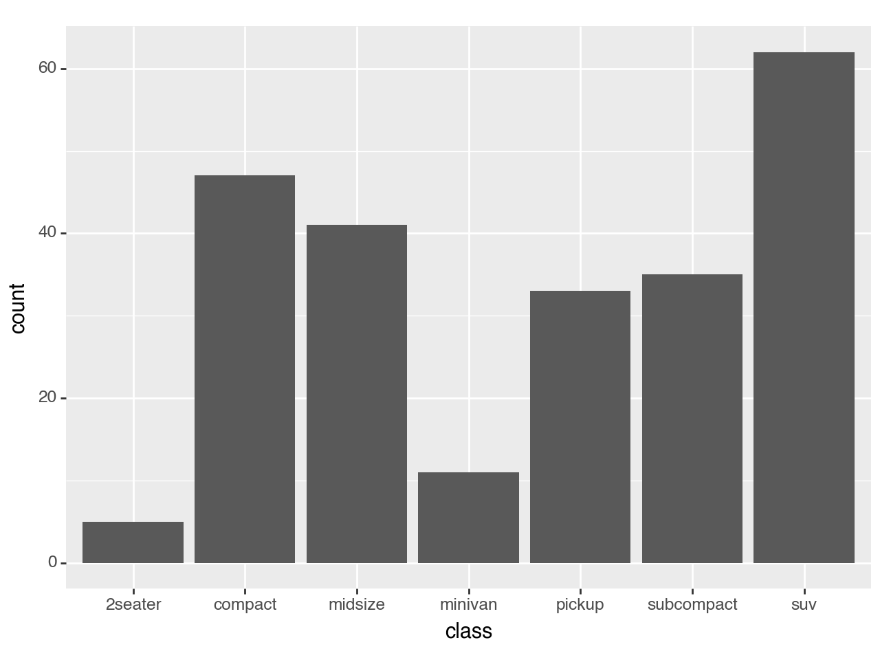
<Figure Size: (640 x 480)>Note that none of these are like R due to differing white space rules.
Faceting
ggplot(mpg) + \
    aes(x = 'drv', y = 'cty', color = 'class', size='cyl') + \
    geom_point()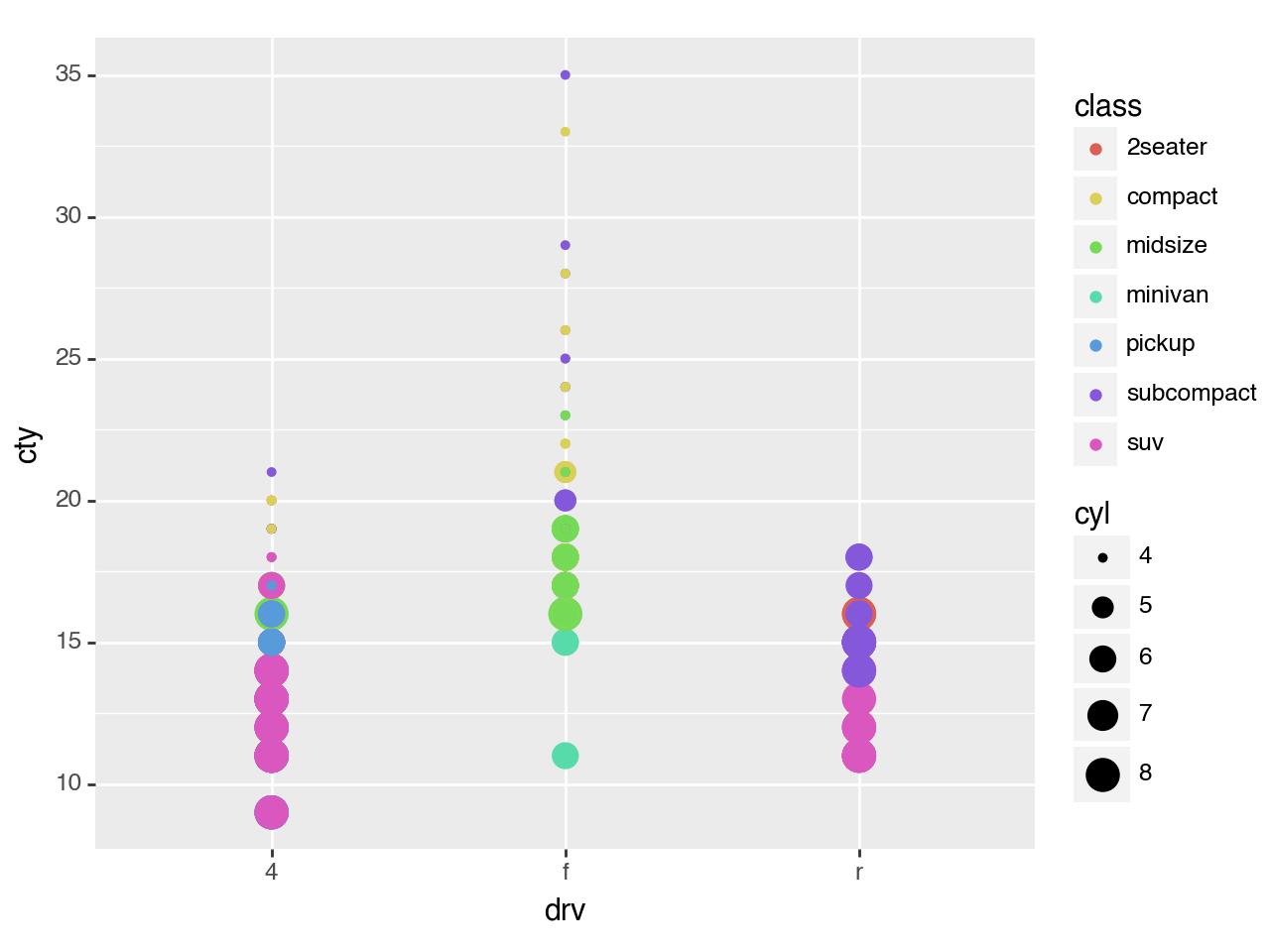
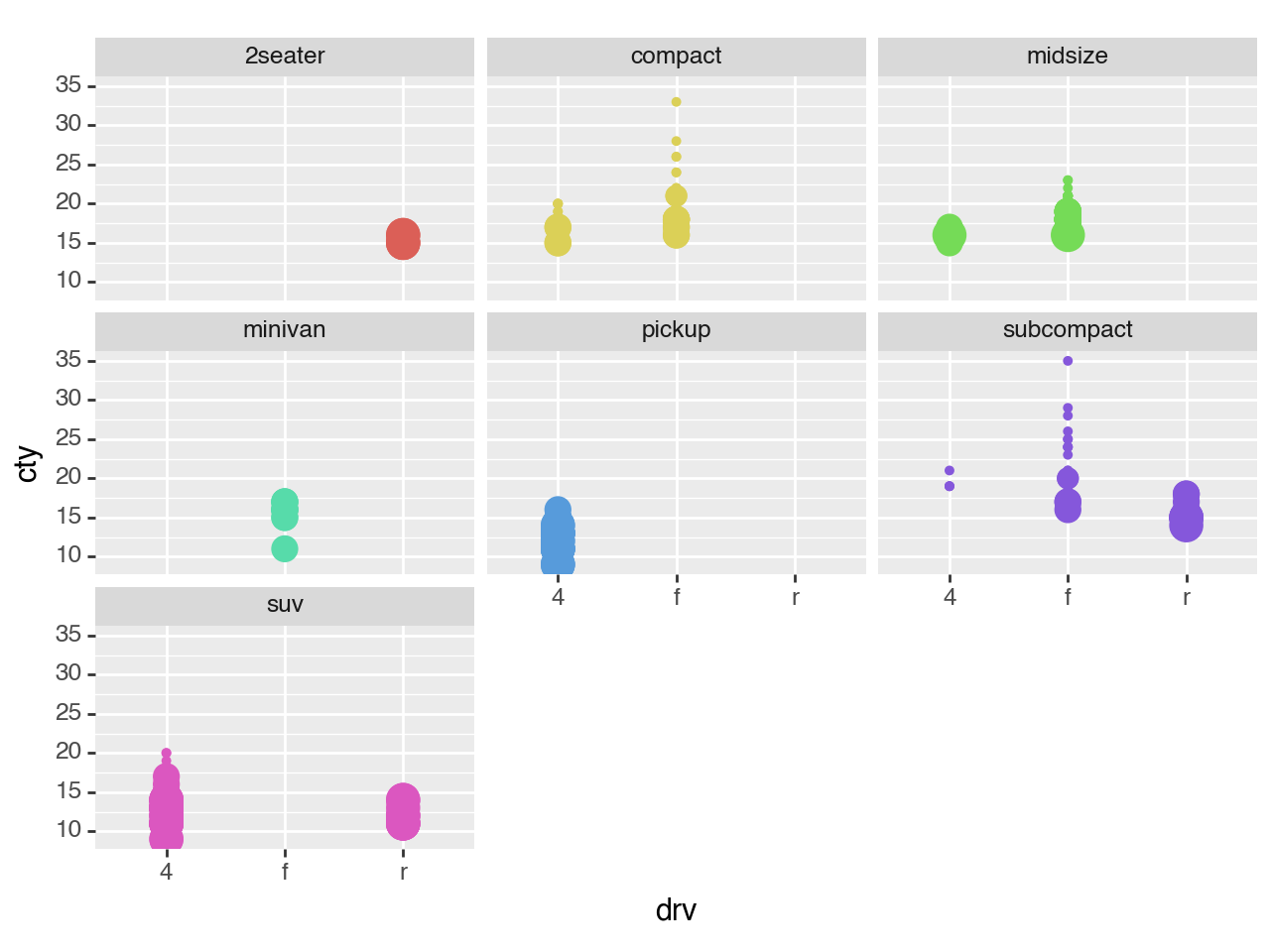
<Figure Size: (640 x 480)>(ggplot(mpg)
+ aes(x='drv', y='cty', color='class', size='cyl')
+ geom_point()
+ facet_wrap('class')
+ theme(legend_position = "none")
)
<Figure Size: (640 x 480)>The Pandas Way
Note the GGPlot included the computation of counts in the geom_bar() function.
ggplot(mpg) + aes(x='class') + geom_bar(size=20)
<Figure Size: (640 x 480)>%matplotlib inline# mpg['class'].plot.bar()mpg['class'].value_counts().sort_index().plot.bar(rot=45);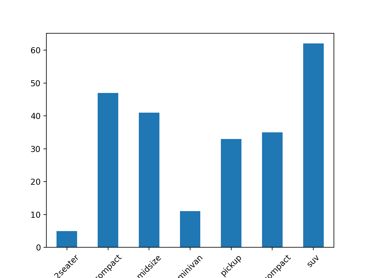
However, sometomes Pandas does do internal calculations, as with .hist():
mpg['cty'].hist();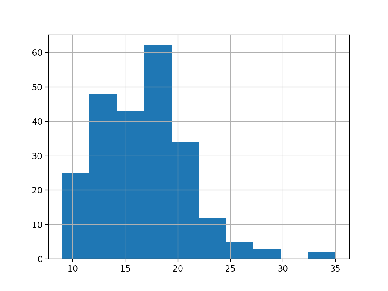
For faceting in Pandas, see this: https://stackoverflow.com/questions/29786227/how-do-i-plot-facet-plots-in-pandas
Notice that it is essentially the result of a .groupby() followed by .unstack().
So, Pandas expects you to do the data transformations upfront.
GGPlot2 will handle these in the geometries and facets
GGPlot2 is easier, but Pandas separates comcerns
As a rule, data operations should never take place in the visualization.