GGPlot and the Grammar of Graphics
Programming for Data Science
GGPlot is the graphics package associated with the Tidyverse.
In this notebook, we will present a quick overview of the design principles behind the package.
As with Dplyr, GGPlot2 is a an entirely new system that supplants the older graph functions that are built into R.
It is founded on a principled analysis of its domain and from this develops a basic grammar which can then be expressed in R.
Just as Dplyr is built on a grammar of data consisting of pipable verbs that correspond to the logic data transformation, GGPlot2 is built on a grammar of graphics consisting of nouns that correspond to the architecture of a graphic (aka plot).
The phrase “grammar of graphics” actually comes from the book by that name written by statistician and computer scientist Leland Wilkinson in 1999 and later revised:

It is worth reading if you want to get a solid grounding in visualization, which belongs to the design area of data science.
The Grammar of Graphics takes an object-oriented approach to visualization and formalizes two main principles:
Graphics are built out of distinct layers.
In each layer, meaningful plots are constructed through mappings of data onto aesthetics.
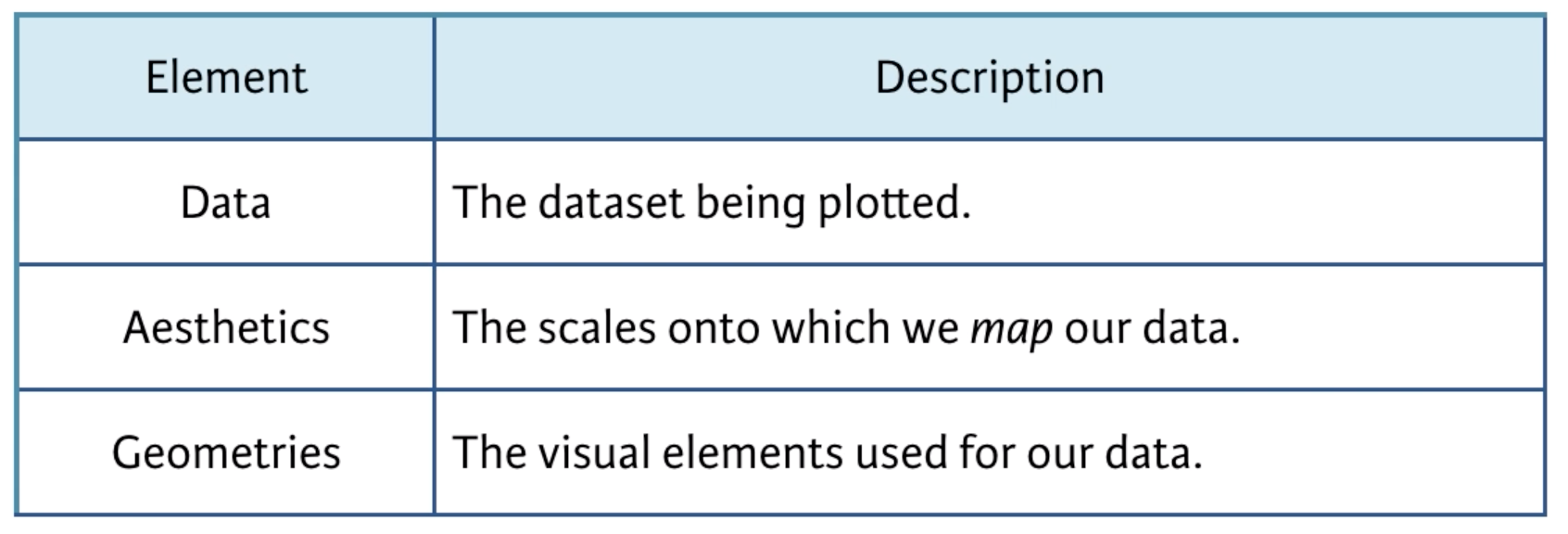
The primary layers are these:

According to Wickham, who adopted these principles and applied them to R,
A grammar of graphics is a tool that enables us to concisely describe the components of a graphic. Such a grammar allows us to move beyond named graphics (e.g., the “scatterplot”) and gain insight into the deep structure that underlies statistical graphics (Wickham 2012).
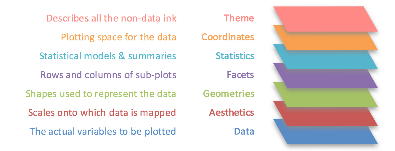
Wickham takes this idea and develops it into this:

Source (see also ScienceCraft).
In this model, everything starts with data.
Then data are mapped on aesthetics within geometries.
Geometries are geometric things like points, lines, and bars.
Aesthetics are visual things like position, size, color and shape.
Also note that aesthetics make use of visual channels to signify features and their properties.
Size can mean greater than, which is good for numeric scale but not categories
Color can signify things like value, e.g. via
red : dangerous : : green : safe.
These compose the primary layers.
The other layers apply downstream modifications that add more information and style to the graph.