Programming for Data Science
In this notebook, we look at GGPlot2, the specific graphics package associated with the Tidyverse.
It implements the logic of the grammar of graphics model described in the previous notebook.
A First Plot
Everything starts with getting ggplot(), which is imported when you import tidyverse.
── Attaching core tidyverse packages ──────────────────────── tidyverse 2.0.0 ──
✔ dplyr     1.1.3     ✔ readr     2.1.4
✔ forcats   1.0.0     ✔ stringr   1.5.0
✔ ggplot2   3.4.4     ✔ tibble    3.2.1
✔ lubridate 1.9.3     ✔ tidyr     1.3.0
✔ purrr     1.0.2
── Conflicts ────────────────────────────────────────── tidyverse_conflicts() ──
✖ dplyr::filter() masks stats::filter()
✖ dplyr::lag()    masks stats::lag()
ℹ Use the conflicted package (<http://conflicted.r-lib.org/>) to force all conflicts to become errors
GGPlot gives lots of warning messages.
For sake of clarity, we are going to turn these off for now.
We’re also going to the set the default size of our plots so they display better.
We do this with the options() function we saw earlier.
options (warn= - 1 )options (repr.plot.width = 16 , repr.plot.height = 10 )
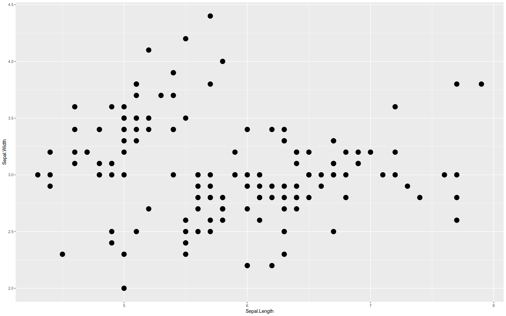
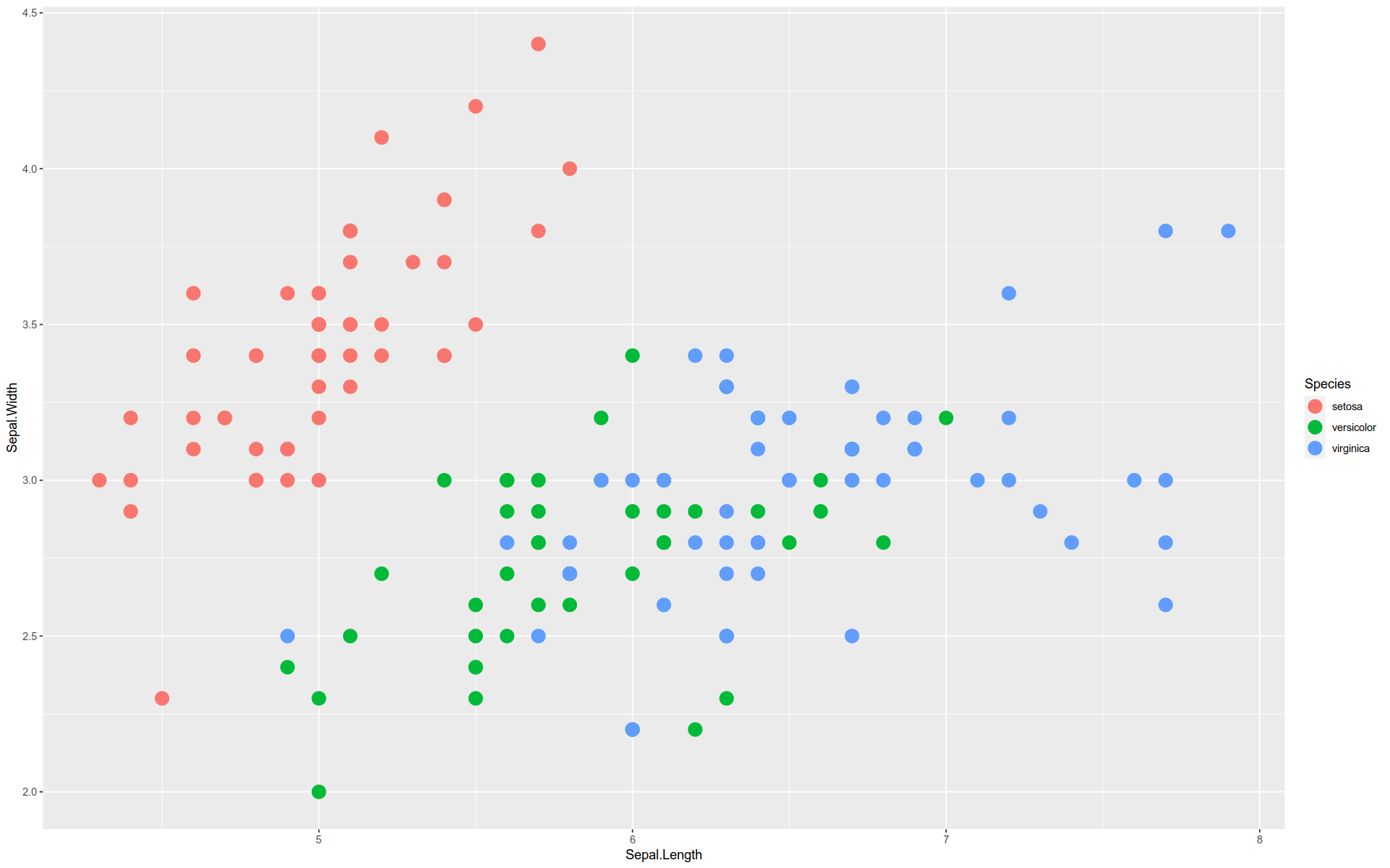
Here is a basic graph — a scatterplot comparing two features in the iris dataset.
The functions and arguments are broken out so you can see how the grammar is implemented:
%>% ggplot (mapping = aes (x = Sepal.Length, y = Sepal.Width)+ geom_point (size = 5 , aes (color = Species)
Here is an alternate way to build the graph:
%>% ggplot () + aes (x = Sepal.Length, y = Sepal.Width) + geom_point (size = 5 ) + aes (color = Species)
Note how we can pull the aes() functions out of the geom_ and mapping() functions.
Note that to create a scatterplot, we did not use a function like geom_scatterplot().
Instead, we constructed one from scratch using the buildings blocks according to a simple design pattern.
We will see that some plot types are constructred this way while others have named functions.
For example, a histogram is created with geom_hist().
How it Works
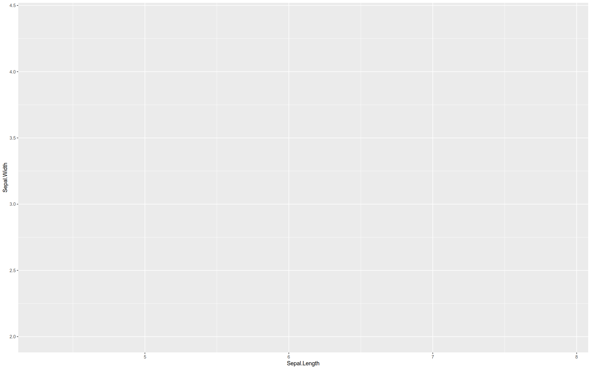
The ggplot() function starts by creating a coordinate system that you can add layers to.
You can think of it as providing a base layer or canvas.
Other layers are added by calling geometry functions.
For example, geom_point creates a point-based visualization.
For each layer, we can apply an aesthetic mapping .
Here’s a description of what we just plotted:
gglot () + # Build the coordinate system, i.e. the base layer canvas aes (x = Sepal.Length, y = Sepal.Width) + # Map two features onto the `x` and `y` axes geom_point (size = 3 ) + # Define a geometry that gives visible form to `x` and `y` coordinates aes (color = Species) # Map colors onto coordinates by a third dimension Note that the coordinate system can be changed after the graph is initiated.
There are many geom_ functions:
geom_point()geom_bar()geom_histogram()geom_boxplot()geom_violin()geom_density()
etc.
These can be layered on top of each other in a variety of ways.
There are also many channels that can used to represent numeric and categorical features with aes():
x and y positions (in a two-dimensional system)
Color
Size
Shape
Text
A Two Layered Plot
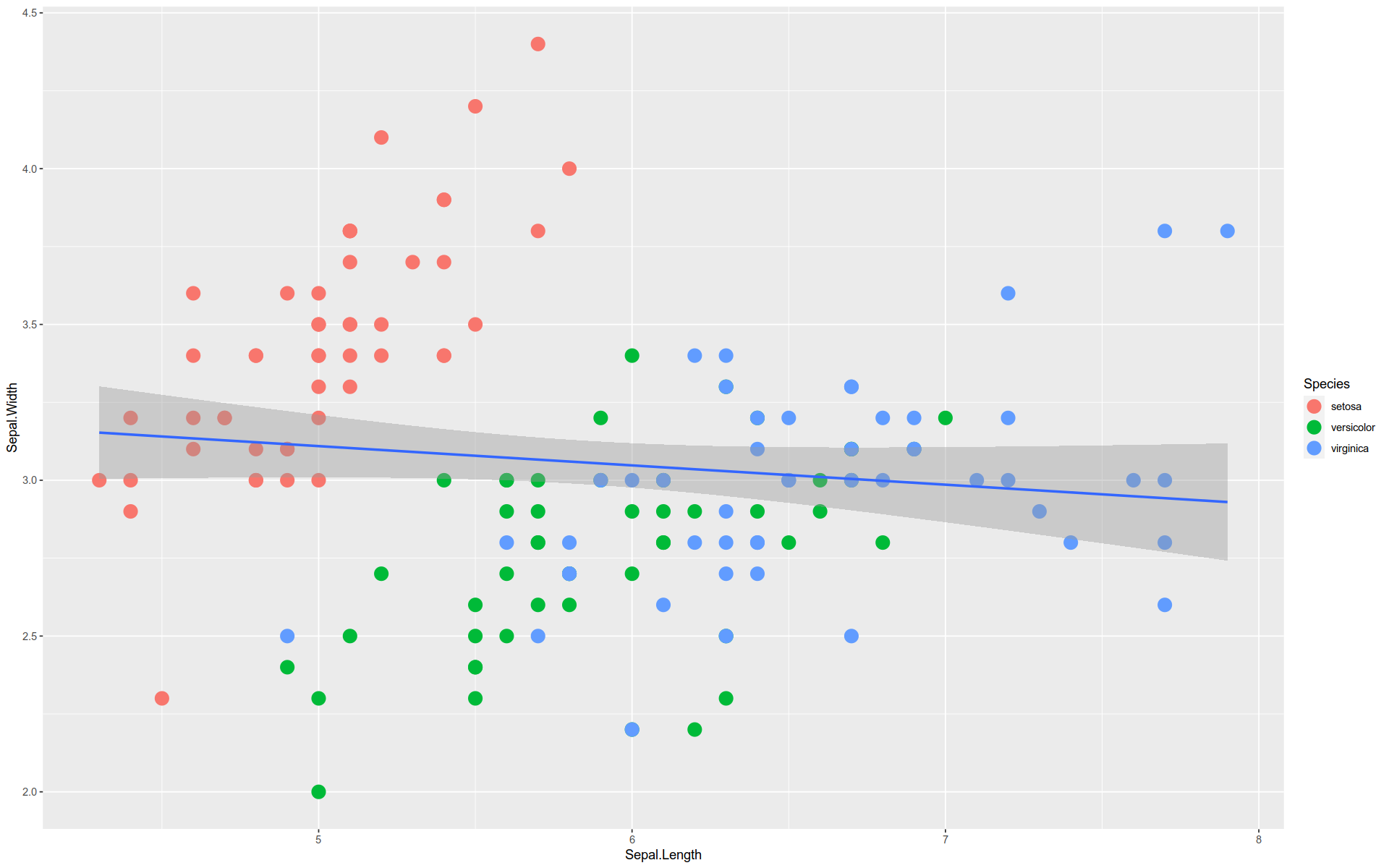
Here we have a plot with two layers.
The second layer is created by a stat_ function.
This function internally applies a geom_ function to a statistical transformation to the data.
%>% ggplot (aes (x = Sepal.Length, y = Sepal.Width)) + geom_point (size = 5 , aes (color = Species)) + stat_smooth (method = lm)
`geom_smooth()` using formula = 'y ~ x'
The tilde sign ~ means “as a function of” — in this case, y is being plotted as function of x.
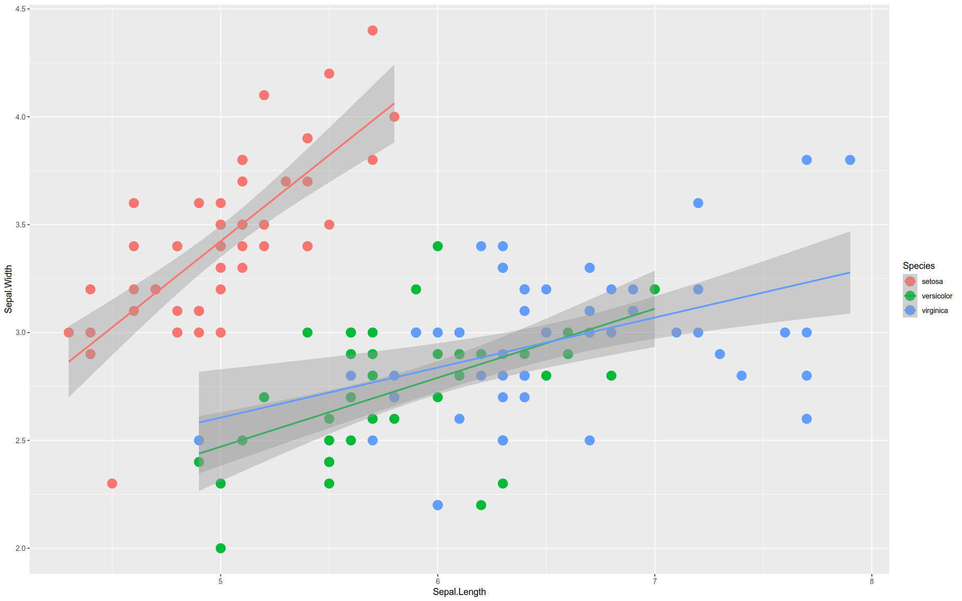
Interestingly, if we pull the aes() function out of geom_point(), we get a different plot.
%>% ggplot () + aes (color= Species) + geom_point (size = 5 ) + aes (x = Sepal.Length, y = Sepal.Width) + stat_smooth (method = lm)
`geom_smooth()` using formula = 'y ~ x'
The + Operator
You will notice the use of the + operator to connect GGPlot functions together to produce a final product.
Theses are not quite the same as pipes %>%.
Whereas pipes feed data from one function to another, the + operation is a form of method chaining .
We saw method chaining in Pandas.
Keep in mind: the + always goes at the end of a line , never at the beginning.
Faceting
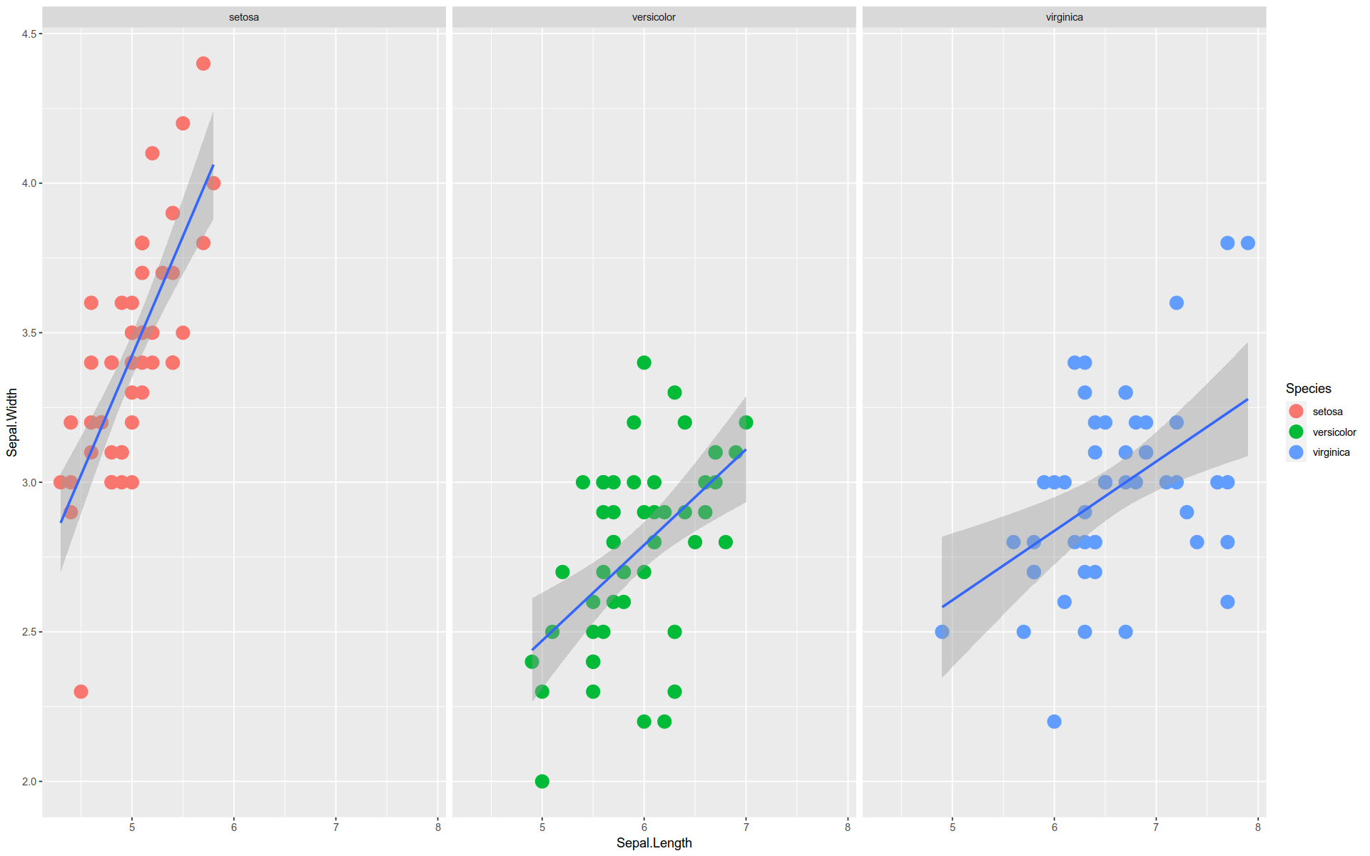
GGPlot also provides plot faceting .
Faceting is the visual equivalent of grouping in the split-apply-combine pattern.
Just as with grouping, the distinct values in a data feature are used to divide the visualization into groups.
Each group takes the same form but shows a different subset of data.
%>% ggplot (aes (x = Sepal.Length, y = Sepal.Width)) + geom_point (size = 5 , aes (color = Species)) + stat_smooth (method = lm) + facet_wrap (facets = vars (Species))
`geom_smooth()` using formula = 'y ~ x'
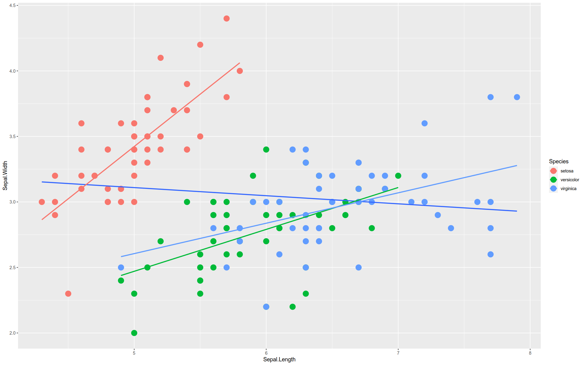
By the way, this is an example of Simpson’s Paradox.
The overall trend is downward, but each group trend upward.
We can see this by layering the regression line for the aggregate over the individual ones.
%>% ggplot (aes (x = Sepal.Length, y = Sepal.Width)) + geom_point (size = 5 , aes (color= Species)) + stat_smooth (method = lm, se= F) + stat_smooth (method = lm, se= F, aes (color= Species))
`geom_smooth()` using formula = 'y ~ x'
`geom_smooth()` using formula = 'y ~ x'
Note, the se argument in stat_smooth() toggles whether or not to display the shaded confidence intervals.
Visualizing Dimensions
Aesthetics and facets are ways to represent extra dimensions without resorting to increasing the number of axes in our plots.
For example, instead of using color or facets to represent species, we might have considered a third axis z to represent this feature.
We tend to avoid going beyond two axes in our plots and so resort to other visual devices.
Bar Chart
Let’s look at some other geometries.
Here is a simple bar chart made with gemo_bar().
%>% ggplot (aes (x = cyl)) + geom_bar (fill = 'limegreen' )
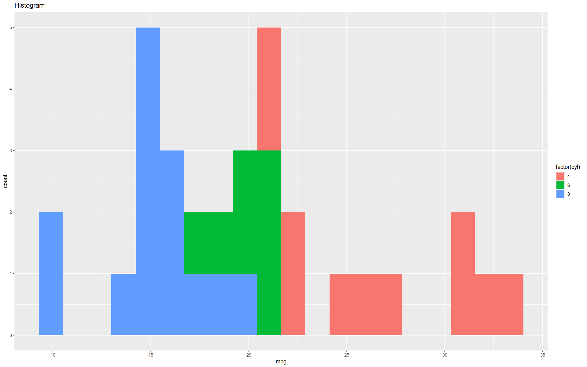
Histogram
The function geom_hist() will generate a histogram.
Note that this function actually performs a behind-the-scenes data transformation, which goes beyond mapping the data.
We typically see this with the stat_ family of functions.
%>% ggplot (aes (x = mpg)) + geom_histogram (bins = 20 , aes (fill = factor (cyl))) + labs (title= "Histogram" )
Note the use of the lab() function to provide a title.
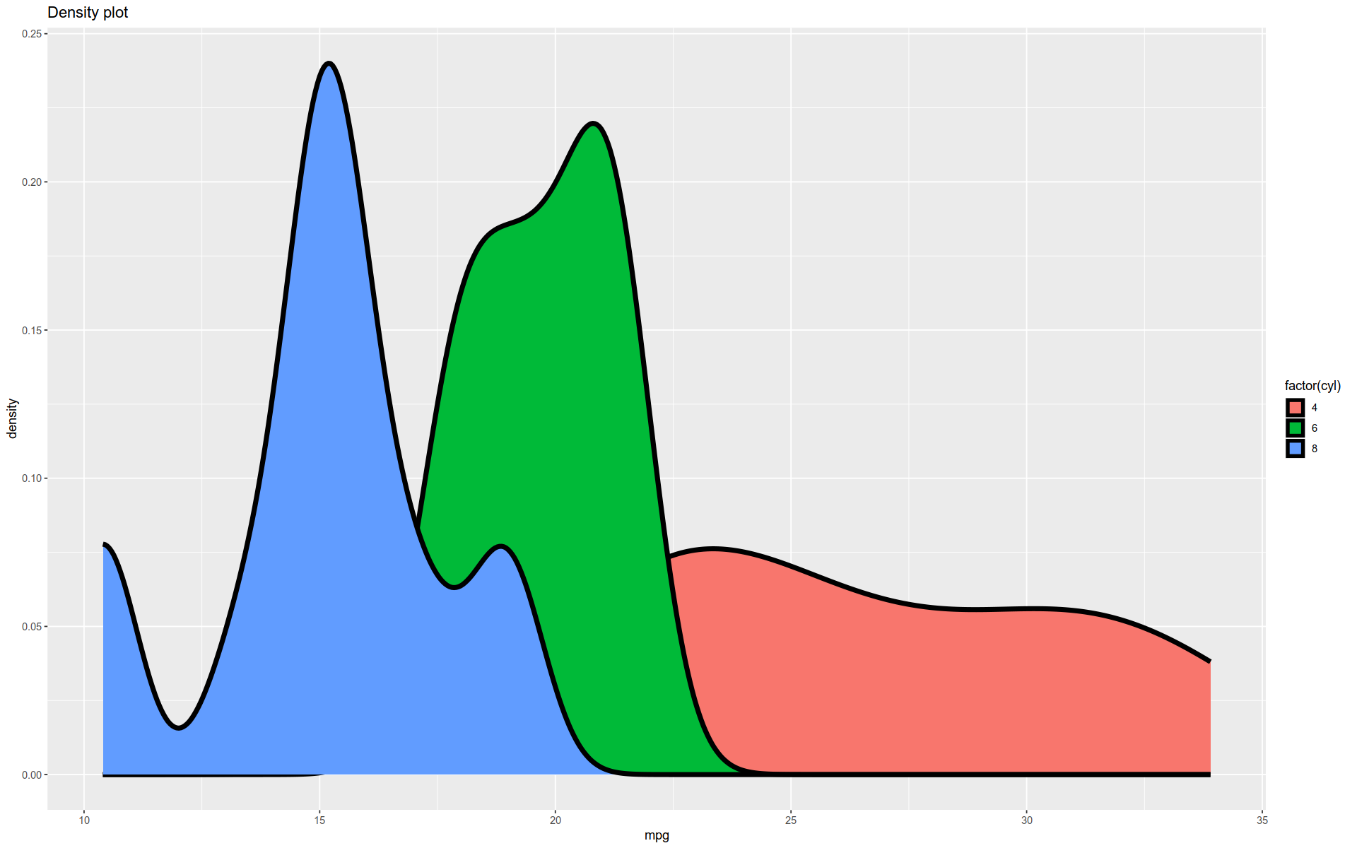
Density Plot
Here is a kernel density estimate (KDE) plot made with geom_density().
A KDE plot is a smoothed version of a histogram.
As with geom_histogram(), this function does some behind-the-scenes compuation and then plots the result.
%>% ggplot (aes (x = mpg)) + geom_density (size = 2 , aes (fill = factor (cyl))) + labs (title= "Density plot" )
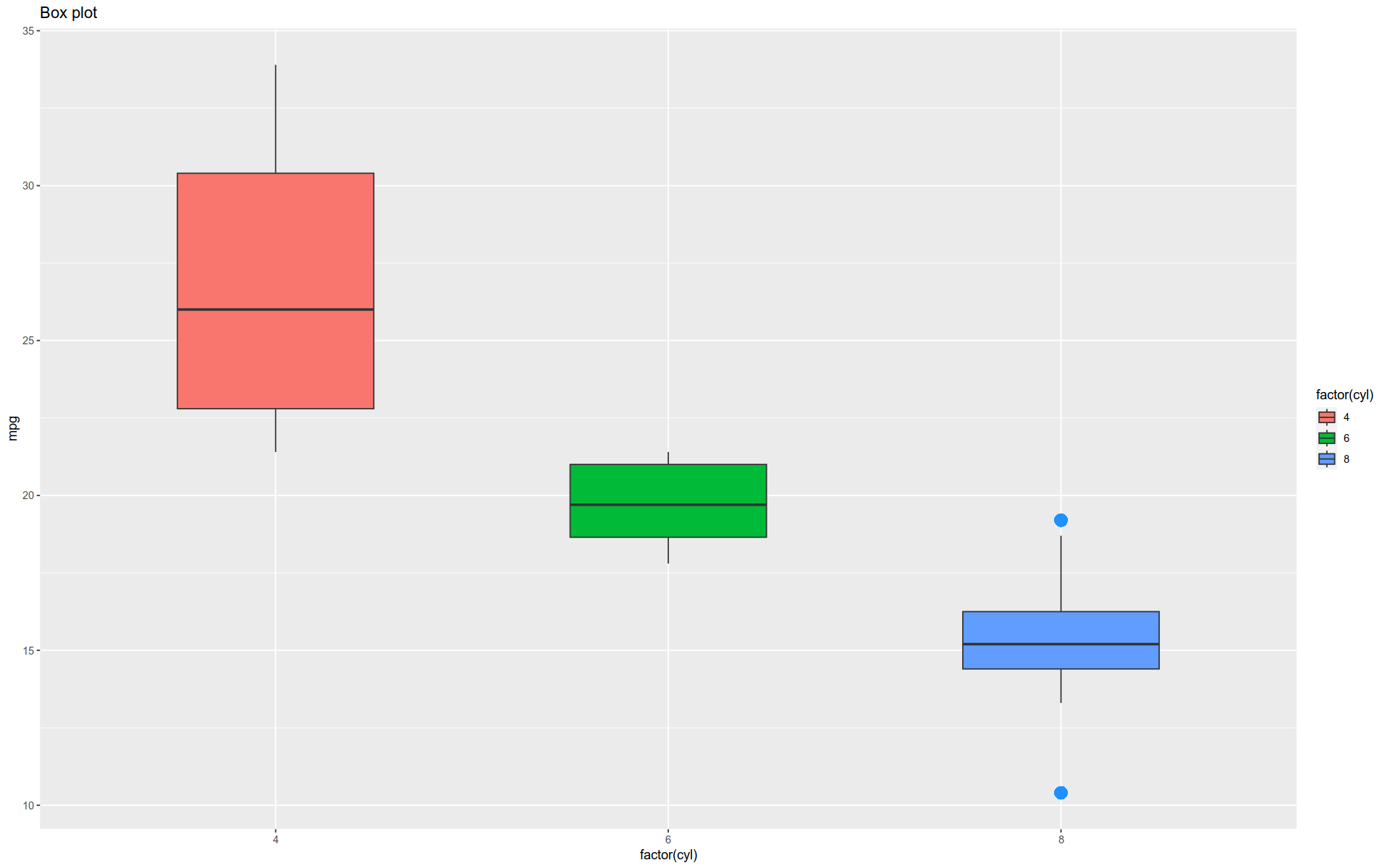
Boxplot
The function geom_boxplot() gives a classic boxplot, showing the mean, quantiles, and outliers of each variable.
Note the arguments used — they control how the outliers are rendered.
Notice we also pull out the aes() function for clarity; it could have remained within the geometry function’s argument space.
%>% ggplot (aes (x = factor (cyl), y = mpg)) + geom_boxplot (width = 0.5 , outlier.colour = "dodgerblue" , outlier.size = 4 , outlier.shape = 16 , outlier.stroke = 2 , + aes (fill = factor (cyl)) + labs (title = "Box plot" )
Violin Plot
This is a violin plot using geom_violin().
A violin plot is something like a smoothed version of a boxplot.
This version is untrimmed, i.e. we set trim to FALSE.
%>% ggplot (aes (factor (cyl), mpg)) + geom_violin (width = 0.5 , trim = F) + aes (fill = factor (cyl)) + labs (title = "Violin plot" )
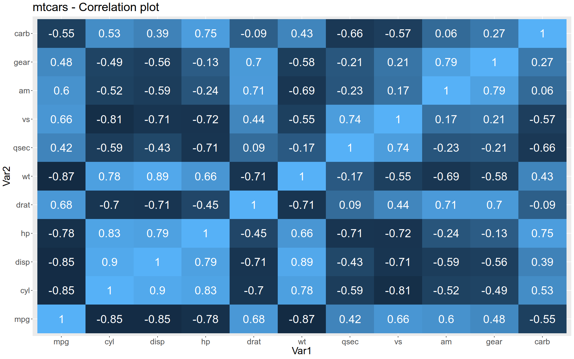
Heatmap
To create a heatmap, we use geom_tile().
To use this function, we first need to reshape our data into narrow form.
Here, we take a correlation matrix among the features of mtcars.
<- round (cor (mtcars), 2 )
A matrix: 11 × 11 of type dbl
mpg
1.00
-0.85
-0.85
-0.78
0.68
-0.87
0.42
0.66
0.60
0.48
-0.55
cyl
-0.85
1.00
0.90
0.83
-0.70
0.78
-0.59
-0.81
-0.52
-0.49
0.53
disp
-0.85
0.90
1.00
0.79
-0.71
0.89
-0.43
-0.71
-0.59
-0.56
0.39
hp
-0.78
0.83
0.79
1.00
-0.45
0.66
-0.71
-0.72
-0.24
-0.13
0.75
drat
0.68
-0.70
-0.71
-0.45
1.00
-0.71
0.09
0.44
0.71
0.70
-0.09
wt
-0.87
0.78
0.89
0.66
-0.71
1.00
-0.17
-0.55
-0.69
-0.58
0.43
qsec
0.42
-0.59
-0.43
-0.71
0.09
-0.17
1.00
0.74
-0.23
-0.21
-0.66
vs
0.66
-0.81
-0.71
-0.72
0.44
-0.55
0.74
1.00
0.17
0.21
-0.57
am
0.60
-0.52
-0.59
-0.24
0.71
-0.69
-0.23
0.17
1.00
0.79
0.06
gear
0.48
-0.49
-0.56
-0.13
0.70
-0.58
-0.21
0.21
0.79
1.00
0.27
carb
-0.55
0.53
0.39
0.75
-0.09
0.43
-0.66
-0.57
0.06
0.27
1.00
The we melt it into narrow form:
<- reshape2:: melt (corr)
A data.frame: 6 × 3
<fct>
<fct>
<dbl>
1
mpg
mpg
1.00
2
cyl
mpg
-0.85
3
disp
mpg
-0.85
4
hp
mpg
-0.78
5
drat
mpg
0.68
6
wt
mpg
-0.87
Now we can pass the narrow data frame to our plot constructor:
%>% ggplot () + aes (x = Var1, y = Var2, fill = value, label = value) + geom_tile () + geom_text (color = "white" , size = 8 ) + labs (title= "mtcars - Correlation plot" ) + theme (text= element_text (size = 20 ), legend.position = "none" )
Note the use of theme() function to remove the legend and alter the font size in the result.
Assigning to a Variable
We can assign plots to variables and build them incrementally.
<- iris %>% ggplot ()
<- gg + aes (x = Sepal.Length, y = Sepal.Width)
<- gg + geom_point (size= 5 )
<- gg + aes (color = Species)
<- gg + stat_smooth (method = 'lm' )
`geom_smooth()` using formula = 'y ~ x'
Design Pattern
Let’s use this ability to assign plots to variables to demonstrate another design pattern.
Often, you will have data of a certain kind and you want to visualize it various ways.
You may not be sure of the most effective visualization, so you want to play around.
For example, you may want to explore the relationship between two continuous variables.
This relationship can visualized using a variety of geometries.
So, we may begin by assigning the basic plot to a variable and then applying different geometries to it.
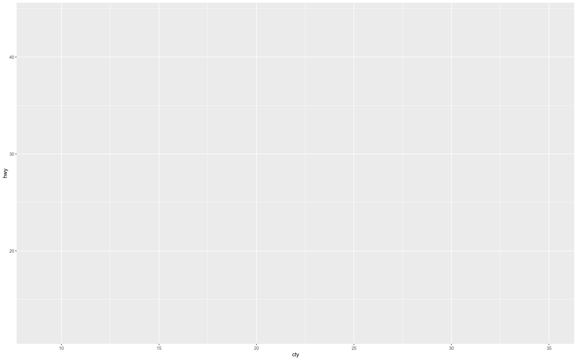
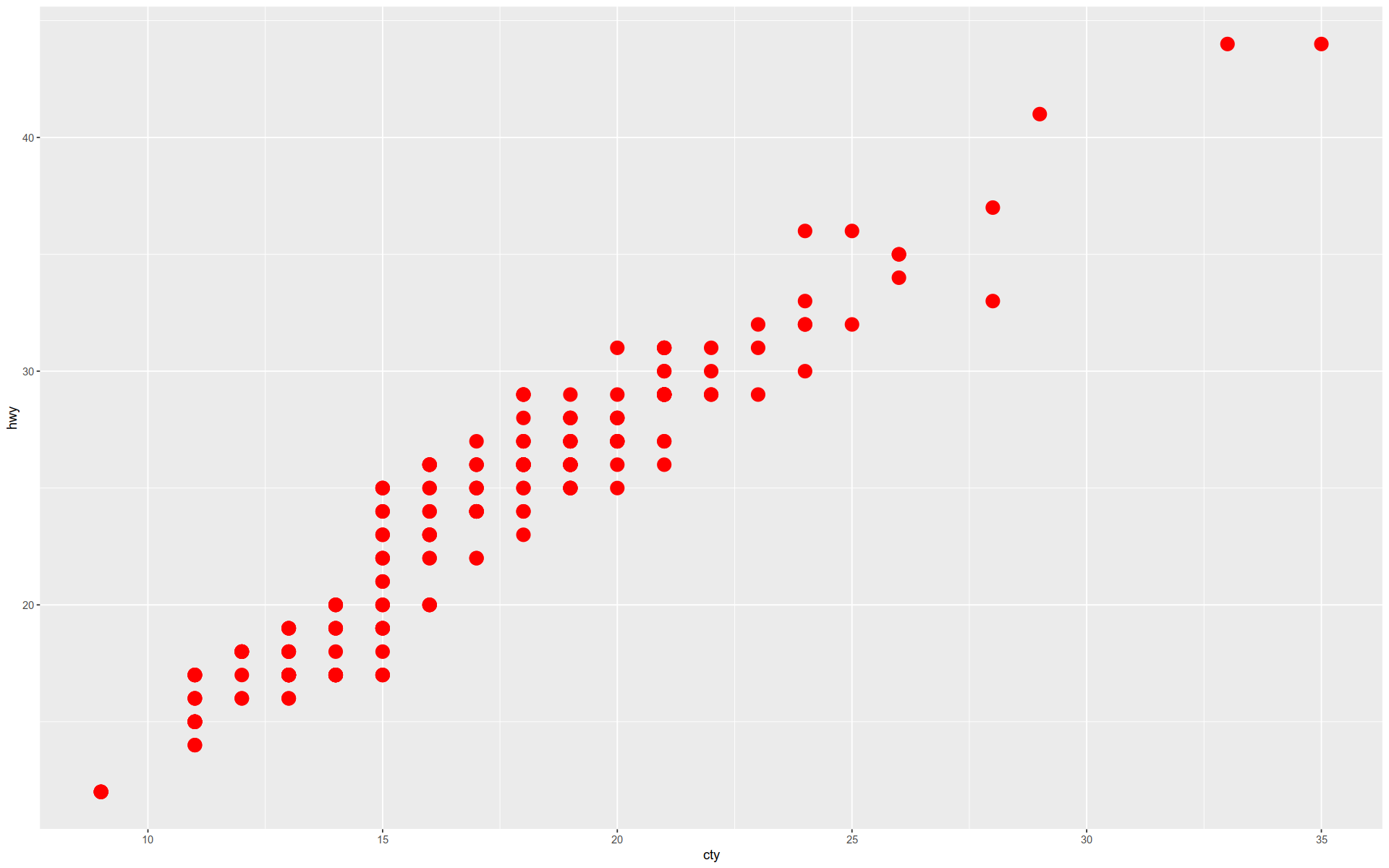
<- ggplot (mpg, aes (cty, hwy))
The object my_gg just contains a blank canvas with two labeled and scaled axes.
Here we draw a simple scatter plot by adding a geometry to our object.
+ geom_point (size= 5 , color= 'red' )
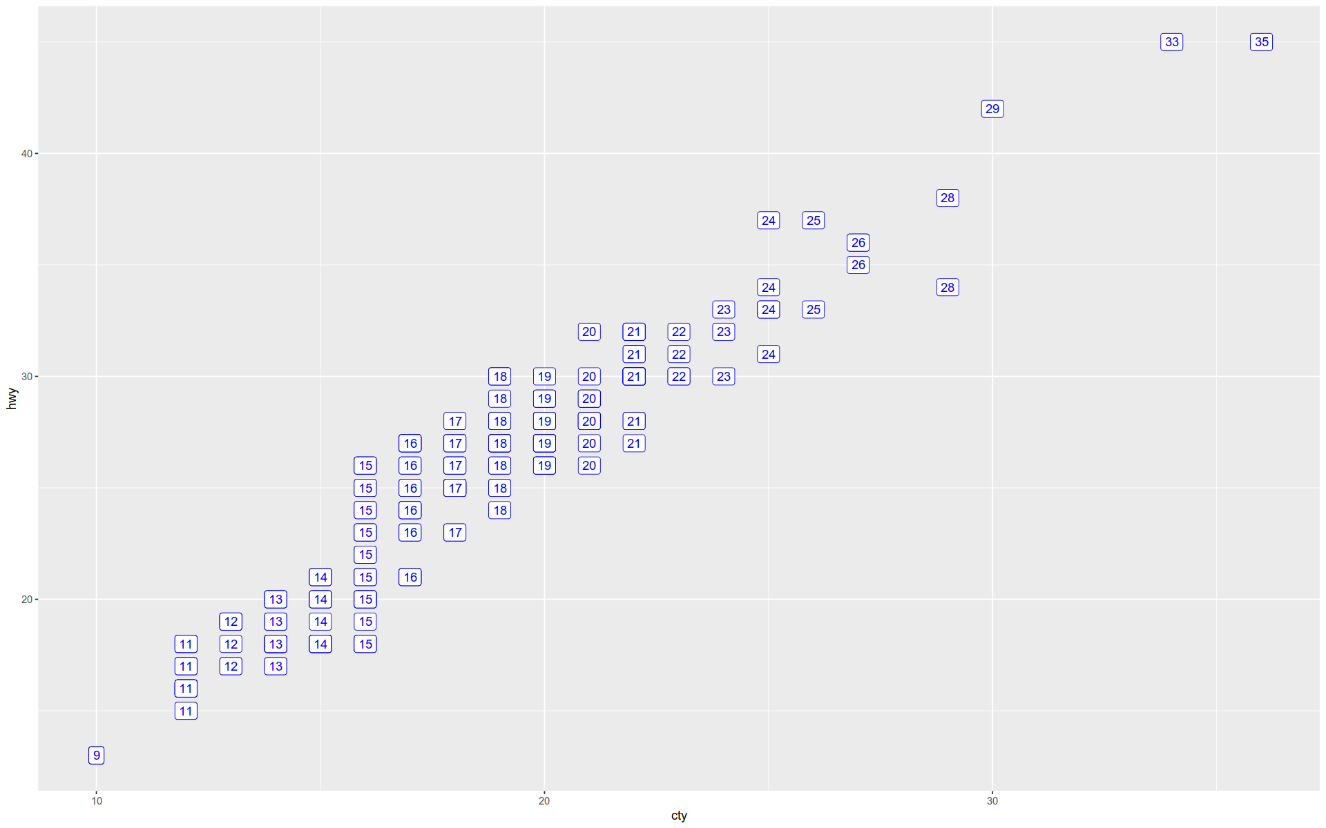
Here we show the coordinates as text labels showing cty with a rectangle background.
The object remains unchanged by the previous visualization; we are just swapping out geometries.
+ geom_label (aes (label = cty), nudge_x = 1 , nudge_y = 1 , color = 'blue' )
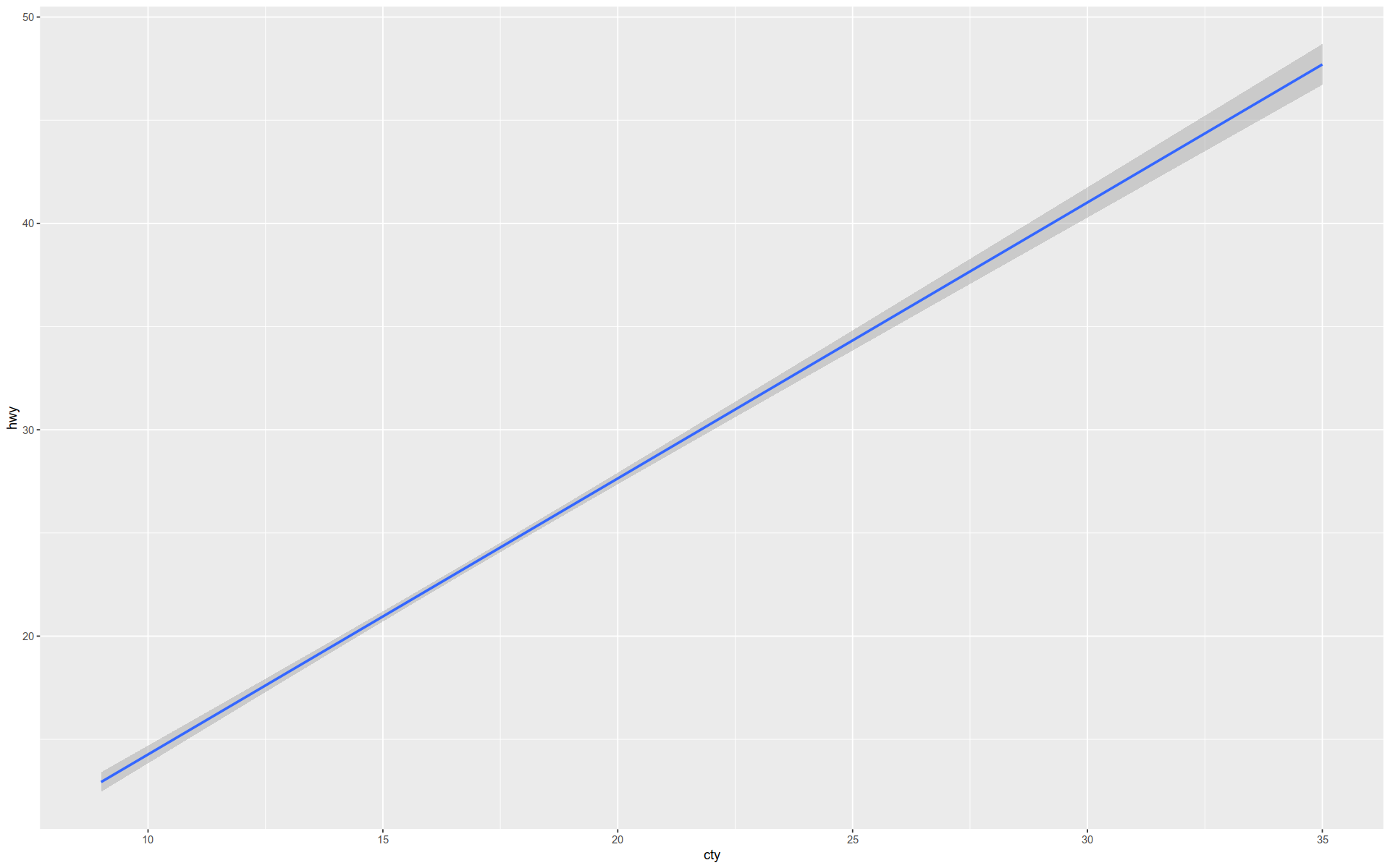
Here is a simple regression line.
+ geom_smooth (method = lm)
`geom_smooth()` using formula = 'y ~ x'
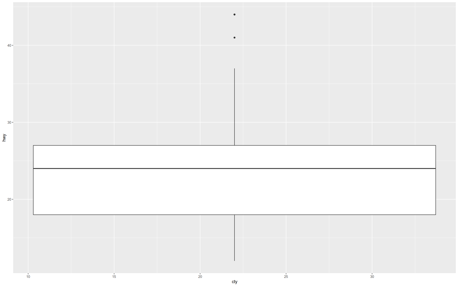
And here is a boxplot …
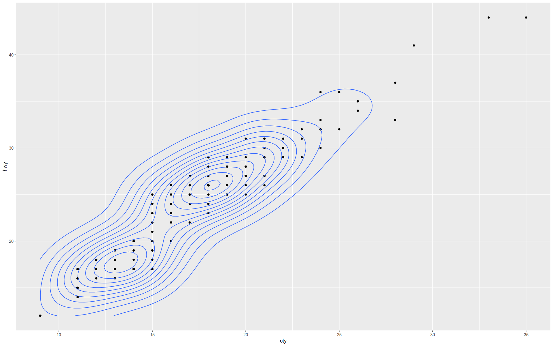
The geom_density2d() function shows a \(2\) D kernel density estimation overlaying a scatterplot.
+ geom_point () + geom_density2d ()
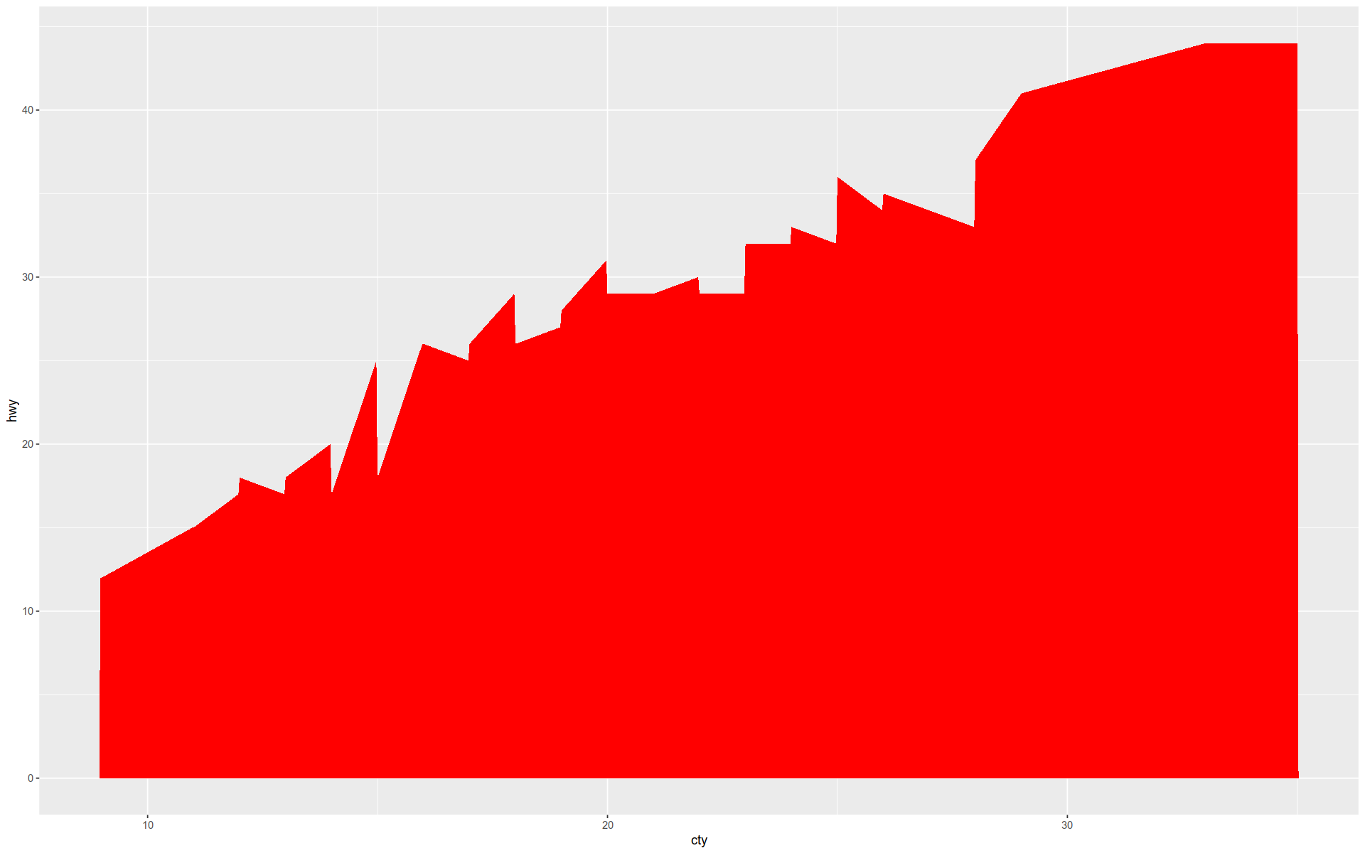
And here is filled line graph.
+ geom_area (fill= 'red' )
Conclusion
This notebook just scratches the surface of what you can do with GGPlot.
There are many other features we have not covered, such as changing coordinates.
In addition, there are many more geometry and statistics layers we have not shown.
However, hopefully you understanding something of the logic of GGPlot and have gained insight into how graphics are built.
This should enable you to make informed guesses and asked effective questions as you develop your knowledge of this powerful toolkit.


